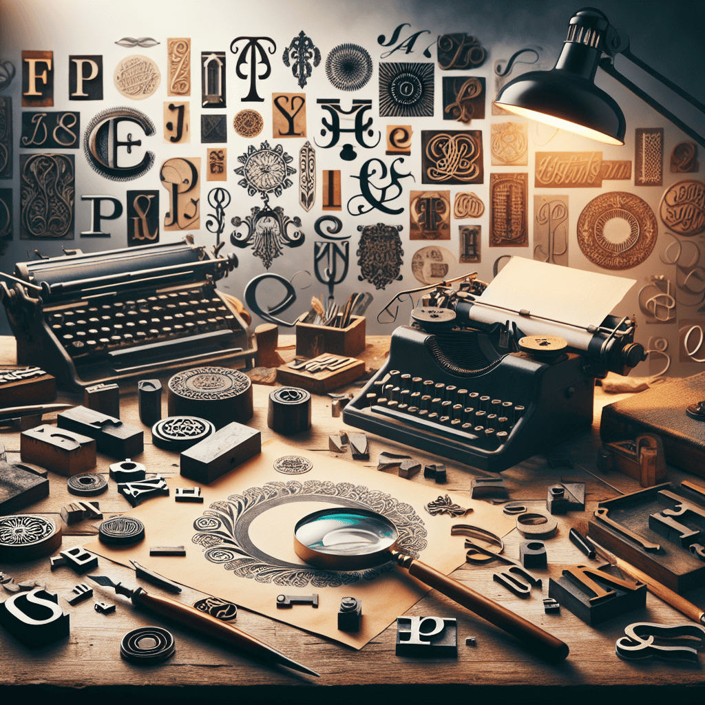
The Importance of Typography in Design
Typography plays a crucial role in design, as it can make or break the overall look and feel of a project. Effective use of typography can enhance the readability of content, create visual hierarchy, evoke emotion, and establish brand identity. Understanding the fundamentals of typography and mastering its principles can elevate your design work to the next level.
Choosing the Right Typeface
When selecting a typeface for your design project, consider the tone and message you want to convey. Serif typefaces are often associated with tradition and elegance, while sans-serif typefaces are more modern and clean. Display typefaces can add personality and flair to a design, while script typefaces evoke a sense of elegance and sophistication.
Font Pairing
Pairing typefaces is an art form in itself. When combining different typefaces, ensure that they complement each other in terms of style, weight, and spacing. Consider using a serif typeface for headings and a sans-serif typeface for body text to create a harmonious balance in your design.
Typography Hierarchy
Establishing hierarchy in typography is essential for guiding the reader’s eye through the content. Use a combination of font size, weight, and color to create contrast and emphasis. Headlines should be bold and eye-catching, while body text should be easy to read and navigate.
Grid Systems
Utilizing grid systems can help maintain consistency and alignment in your typography design. By setting up a grid, you can easily establish a baseline grid, vertical rhythm, and column structure for your text. This ensures that your typography remains cohesive and visually appealing.
Whitespace and Line Spacing
Whitespace, also known as negative space, is an important design element that allows text to breathe and improves readability. Proper line spacing can also impact the overall aesthetic of your typography. Experiment with different line heights and paragraph spacing to find the perfect balance for your design.
Text Alignment
Consider the alignment of your text when designing typography. Left-aligned text is the most common and easiest to read, while centered text can create a more formal and symmetrical look. Justified text aligns both the left and right edges, but can sometimes result in awkward spacing and hyphenation.
Color and Contrast
Color can enhance the visual impact of typography and add personality to your design. Use color strategically to create contrast and emphasis in your typography. Bright colors can draw attention to important information, while muted tones can create a more subtle and sophisticated look.
Accessibility
When designing typography, consider accessibility for all users. Ensure that your text is legible and easy to read for people with visual impairments. Use high-contrast color combinations and avoid using small font sizes or decorative typefaces that may be difficult to decipher.
Conclusion
Mastering typography is an essential skill for any designer looking to create compelling and effective visual communication. By understanding the principles of typography, choosing the right typefaces, establishing hierarchy, and paying attention to details such as whitespace and color, you can elevate your design work to the next level. Experiment with different styles, techniques, and tools to find what works best for your project, and remember that typography is not just about letters on a page—it’s about creating an immersive and engaging experience for the reader.
Searching for Affordable Business Logo Design? Check out our Logo Design Service
View all our Digital Marketing Services
Schedule a Logo Design Strategy Call


0 Comments